1 MLC
British consumers were becoming increasingly concerned about the lack of information regarding the origin of meat products in supermarkets and restaurants. This led to British Meat and the British Livestock Commission launching a campaign to introduce 'country of origin' branding. By doing so, the UK meat industry would be protected against cheap, and often inferior, meat imports. At the time, I was freelancing for a below-the-line (trade advertising) agency who asked me to create a dps ad to announce the campaign in 'The Grocer' magazine. (Ad shown below.) Apparently the client loved the headline but thought the image was "too beef specific", so the ad ran with a photo of animal carcasses hanging in a freezer room (whaaat?!). Sometimes I think clients shouldn't be allowed anywhere near their ads 'til they're up and running.

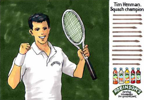
2 SQUASH
Robinson's were about to launch a new range of fruit squashes at the same time as the forthcoming Wimbledon tennis tournament. An ad was booked in 'The Grocer' magazine to get the trade to stock up in readiness for the TV campaign and to take advantage of Tim Henman's high media profile (Robinson's were one of his major sponsors). Produced what I thought was a great ad - it answered the brief exactly. Unfortunately it was rejected (not product focused enough). They ran with another of my ads that just showed the product range beneath the headline 'Reigning again at Wimbledon' - no mention of Henman though.
3 GOV
Learning For Life - a government initiative to encourage adult education. I designed this poster to launch the campaign in libraries and town halls etc. in order to get people to achieve an educational ambition - to learn a second language, learn basic car or motorcycle maintenance, or first aid etc. Unfortunately it didn't run, but it did serve as a discussion opener to more clearly define the project's aims and requirements, so it wasn't entirely a wasted effort.

4 HONDA
I'd noticed that more and more motorcycles and cars were being manufactured with a warning message in their wing mirrors. I thought there's an ad there somewhere. Eventually came up with one when I worked at the agency that handled the Honda car account. Scribbled a rough and showed it to an account handler. Nothing came of it, which I thought was a shame. Bit later I saw the same idea being used for BMW cars.

5 CORNISH POINT
A chum liked wine so much he bought a wine growing plot out in New Zealand, emigrated and set about producing his own wines. Bit rash, thought I, but now (about twenty years later) his wines are reckoned to be among the world's best. Anyways..., back then he kindly asked me to design some wine labels for his first 'Cornish Point' wines. My solution featured a 'C' formed as a maroon wine glass stain (as on a white tablecloth, actual size, but not the complete circle) with added black typography. Rejected. Too modern and risky. He wanted a wine label that looked like a wine label. Huh? I think he felt that a 'modern' design made the wine look cheap and rubbishy. Best to play safe. Ah well, another one bites the dust. https://www.therealreview.com/2018/03/07/felton-road-cornish-point-vertical/
I hasten to say that I was not involved in this rather uninspired design:

No comments:
Post a Comment