
Tuesday, 17 December 2019
Unemployment
The idea was simple. The
execution wasn't. I initially thought that photography was the way to
go, but then changed my mind. Somewhat impishly I decided to mimic the
style of a highly esteemed and very trendy illustrator. With hindsight, I
think I wanted to show that doing 'style' is far less of a challenge
than coming up with a good idea. Style's easy. Ideas ain't.


Logos
In one of Bob Gill's projects at the RCA we had to submit our design solutions by phone. This hammered home Bob's mantra that ideas were superior to style. So..., bearing in mind this important lesson, I once had to design a stationery range (and van) for an electrician. My solution was to cut out three oblong holes on the letterhead, business card, etc. (as in a three-pin plug socket) with his name underneath. For his van the three holes were painted black on white. Years later I saw someone had used this idea in D&AD. Ah well, ç'est la vie.
Just remembered another one: Ages ago, one of my design partners was playing around with different letter forms spelling 'Alphabet'. "What that?" says I. "Logo for a typesetting company" says he. "Hmm, bit mundane" says I. He seemed a bit miffed. I then suggested an apple and a zebra might be more interesting. And that's what he did. Won design awards. He got the credit while I got, er, um. Ah well, ç'est la vie.
Some other logoey symboley type things:


BMW
As creative director of BBA I had the privilege of working on a wide variety of projects for their blue chip client, BMW (GB). In one of their most
challenging briefs we were asked to produce a direct mailer to announce
the launch of the new, top of the range, BMW 6 Series. Our solution was '6 by 6' - a
presenter containing six limited edition photos, shot and signed by six
leading photographers including Ken Griffiths, Dennis Waugh and Pete
Lavery (all old mates of mine from the RCA that I managed to rope in),
together with a 'gallery guide' brochure.
After completing the job, I resigned.
Later, unbeknown to me, BBA entered '6 by 6' for the prestigious D&AD awards. When I discovered it had been accepted by the design jury, I wasn't at all surprised.
However, what did surprise me were the design credits. These listed about a dozen people, ten of whom had no involvement with the project at all, and the eleventh listed as creative director (what?!), while my name was dumped at the bottom of the list - scant reward for almost single-handedly designing and art directing the whole thing. And spiteful retribution for resigning I suppose.


BMW JAPAN
When BBA became BGA, they (somewhat surprisingly) invited me to join the new regime, and (even more surprisingly) I agreed to join as creative director. A new client was BMW Japan and one of their first briefs was for a 30 second TV ad which I scripted and art directed - a valuable first experience in TV commercials. Some time later (after I'd left the company for a second time, not on the best of terms - no surprise there) BGA were tasked with another TV ad for BMW Japan. The BGA creatives had failed to solve the brief so a top advertising freelance duo were hired to produce some ideas - none of which were successful. Probably as a last resort BGA asked if I'd have a crack at the brief. Resisting the temptation to tell 'em to go take a running jump, I set to work and came up with an idea. Luckily, it was accepted so I wrote the script, art directed the shoot and helped produce the soundtrack.
BRIEF: Announce a new, easy payment, BMW finance scheme (wasn't quite that simple but it'll do).
SOLUTION: Your dream can now become a reality. Open with two sequences of a BMW approaching in rear view mirror (black and white but colour in mirror). Car overtakes but doesn't appear ahead (just a dream). Third BMW appears in mirror and as it overtakes we zoom into the mirror and enter the world of BMW (all full colour). Shoot a few 'hero' car shots then zoom back out of the mirror and we're in a BMW dealership (part of the brief).
Job done, the BGA creatives took over and produced the Japanese voice-overs and end titles, then probably took all the credit for the idea and its execution.
Ah well, ç'est la vie.


After completing the job, I resigned.
Later, unbeknown to me, BBA entered '6 by 6' for the prestigious D&AD awards. When I discovered it had been accepted by the design jury, I wasn't at all surprised.
However, what did surprise me were the design credits. These listed about a dozen people, ten of whom had no involvement with the project at all, and the eleventh listed as creative director (what?!), while my name was dumped at the bottom of the list - scant reward for almost single-handedly designing and art directing the whole thing. And spiteful retribution for resigning I suppose.

BMW JAPAN
When BBA became BGA, they (somewhat surprisingly) invited me to join the new regime, and (even more surprisingly) I agreed to join as creative director. A new client was BMW Japan and one of their first briefs was for a 30 second TV ad which I scripted and art directed - a valuable first experience in TV commercials. Some time later (after I'd left the company for a second time, not on the best of terms - no surprise there) BGA were tasked with another TV ad for BMW Japan. The BGA creatives had failed to solve the brief so a top advertising freelance duo were hired to produce some ideas - none of which were successful. Probably as a last resort BGA asked if I'd have a crack at the brief. Resisting the temptation to tell 'em to go take a running jump, I set to work and came up with an idea. Luckily, it was accepted so I wrote the script, art directed the shoot and helped produce the soundtrack.
BRIEF: Announce a new, easy payment, BMW finance scheme (wasn't quite that simple but it'll do).
SOLUTION: Your dream can now become a reality. Open with two sequences of a BMW approaching in rear view mirror (black and white but colour in mirror). Car overtakes but doesn't appear ahead (just a dream). Third BMW appears in mirror and as it overtakes we zoom into the mirror and enter the world of BMW (all full colour). Shoot a few 'hero' car shots then zoom back out of the mirror and we're in a BMW dealership (part of the brief).
Job done, the BGA creatives took over and produced the Japanese voice-overs and end titles, then probably took all the credit for the idea and its execution.
Ah well, ç'est la vie.
Lemon
I worked on quite a few car accounts but, unfortunately, not on Citroen so I never had the opportunity to present this idea I had for promoting the 2CV. Ah well, another one bites the dust.


Rejects
Some of my many rejected works:
1 MLC
British consumers were becoming increasingly concerned about the lack of information regarding the origin of meat products in supermarkets and restaurants. This led to British Meat and the British Livestock Commission launching a campaign to introduce 'country of origin' branding. By doing so, the UK meat industry would be protected against cheap, and often inferior, meat imports. At the time, I was freelancing for a below-the-line (trade advertising) agency who asked me to create a dps ad to announce the campaign in 'The Grocer' magazine. (Ad shown below.) Apparently the client loved the headline but thought the image was "too beef specific", so the ad ran with a photo of animal carcasses hanging in a freezer room (whaaat?!). Sometimes I think clients shouldn't be allowed anywhere near their ads 'til they're up and running.

2 SQUASH
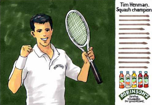
Robinson's were about to launch a new range of fruit squashes at the same time as the forthcoming Wimbledon tennis tournament. An ad was booked in 'The Grocer' magazine to get the trade to stock up in readiness for the TV campaign and to take advantage of Tim Henman's high media profile (Robinson's were one of his major sponsors). Produced what I thought was a great ad - it answered the brief exactly. Unfortunately it was rejected (not product focused enough). They ran with another of my ads that just showed the product range beneath the headline 'Reigning again at Wimbledon' - no mention of Henman though.

3 GOV
Learning For Life - a government initiative to encourage adult education. I designed this poster to launch the campaign in libraries and town halls etc. in order to get people to achieve an educational ambition - to learn a second language, learn basic car or motorcycle maintenance, or first aid etc. Unfortunately it didn't run, but it did serve as a discussion opener to more clearly define the project's aims and requirements, so it wasn't entirely a wasted effort.

4 HONDA
I'd noticed that more and more motorcycles and cars were being manufactured with a warning message in their wing mirrors. I thought there's an ad there somewhere. Eventually came up with one when I worked at the agency that handled the Honda car account. Scribbled a rough and showed it to an account handler. Nothing came of it, which I thought was a shame. Bit later I saw the same idea being used for BMW cars.

5 CORNISH POINT
A chum liked wine so much he bought a wine growing plot out in New Zealand, emigrated and set about producing his own wines. Bit rash, thought I, but now (about twenty years later) his wines are reckoned to be among the world's best. Anyways..., back then he kindly asked me to design some wine labels for his first 'Cornish Point' wines. My solution featured a 'C' formed as a maroon wine glass stain (as on a white tablecloth, actual size, but not the complete circle) with added black typography. Rejected. Too modern and risky. He wanted a wine label that looked like a wine label. Huh? I think he felt that a 'modern' design made the wine look cheap and rubbishy. Best to play safe. Ah well, another one bites the dust. https://www.therealreview.com/2018/03/07/felton-road-cornish-point-vertical/
I hasten to say that I was not involved in this rather uninspired design:

1 MLC
British consumers were becoming increasingly concerned about the lack of information regarding the origin of meat products in supermarkets and restaurants. This led to British Meat and the British Livestock Commission launching a campaign to introduce 'country of origin' branding. By doing so, the UK meat industry would be protected against cheap, and often inferior, meat imports. At the time, I was freelancing for a below-the-line (trade advertising) agency who asked me to create a dps ad to announce the campaign in 'The Grocer' magazine. (Ad shown below.) Apparently the client loved the headline but thought the image was "too beef specific", so the ad ran with a photo of animal carcasses hanging in a freezer room (whaaat?!). Sometimes I think clients shouldn't be allowed anywhere near their ads 'til they're up and running.

2 SQUASH
Robinson's were about to launch a new range of fruit squashes at the same time as the forthcoming Wimbledon tennis tournament. An ad was booked in 'The Grocer' magazine to get the trade to stock up in readiness for the TV campaign and to take advantage of Tim Henman's high media profile (Robinson's were one of his major sponsors). Produced what I thought was a great ad - it answered the brief exactly. Unfortunately it was rejected (not product focused enough). They ran with another of my ads that just showed the product range beneath the headline 'Reigning again at Wimbledon' - no mention of Henman though.
3 GOV
Learning For Life - a government initiative to encourage adult education. I designed this poster to launch the campaign in libraries and town halls etc. in order to get people to achieve an educational ambition - to learn a second language, learn basic car or motorcycle maintenance, or first aid etc. Unfortunately it didn't run, but it did serve as a discussion opener to more clearly define the project's aims and requirements, so it wasn't entirely a wasted effort.

4 HONDA
I'd noticed that more and more motorcycles and cars were being manufactured with a warning message in their wing mirrors. I thought there's an ad there somewhere. Eventually came up with one when I worked at the agency that handled the Honda car account. Scribbled a rough and showed it to an account handler. Nothing came of it, which I thought was a shame. Bit later I saw the same idea being used for BMW cars.

5 CORNISH POINT
A chum liked wine so much he bought a wine growing plot out in New Zealand, emigrated and set about producing his own wines. Bit rash, thought I, but now (about twenty years later) his wines are reckoned to be among the world's best. Anyways..., back then he kindly asked me to design some wine labels for his first 'Cornish Point' wines. My solution featured a 'C' formed as a maroon wine glass stain (as on a white tablecloth, actual size, but not the complete circle) with added black typography. Rejected. Too modern and risky. He wanted a wine label that looked like a wine label. Huh? I think he felt that a 'modern' design made the wine look cheap and rubbishy. Best to play safe. Ah well, another one bites the dust. https://www.therealreview.com/2018/03/07/felton-road-cornish-point-vertical/
I hasten to say that I was not involved in this rather uninspired design:

Paintings
Did a few paintings about six years ago. A new challenge and much harder than coming up with ideas. Shown here are a few of them. Might have another go soon. Or maybe not.


Subscribe to:
Posts (Atom)